How to Make Images Smaller: Crop, Resize, and Compress
Quick Answer: What Are the Best Image Compression Settings?
TL;DR — Making images smaller is a pipeline: crop → resize → compress, in that order. The settings that matter:
- The order is the biggest lever: resizing first alone takes a 5 MB camera photo to ~300 KB before any compression — a 94% reduction. Never compress pixels the visitor won't see.
- Web images: 75–85% quality (WebP) is the sweet spot — 50–70% smaller files with no visible quality loss; heroes 85–92%, thumbnails 60–75% acceptable. Below 60%, artifacts become visible.
- Size targets: hero 1920px → under 300 KB; content/images 1200px → under 150 KB; thumbnails 400–600px → under 50 KB (WebP, per Lighthouse thresholds).
- Format by destination: WebP with a JPG fallback for websites (25–35% smaller than JPG); JPG at 70–80% / 600px for email; PNG only for screenshots, logos, and text-heavy graphics.
- Verify with one number: a DSSIM score below 0.01 means visually identical — ship it; above 0.05, drop quality or dimensions. Pair it with the pixel diff heatmap to localize artifacts.
Why Image Compression Matters
Images are the heaviest assets on almost every website. The HTTP Archive reports that images account for roughly 50% of the average page's total weight. Google's Core Web Vitals — especially Largest Contentful Paint (LCP) — make bloated images a direct ranking factor. They don't just annoy users; they hurt your SEO.
The good news: most bloated images can be 3–10× smaller with zero visible quality loss. The bad news: most people reach for the wrong tool first. Compressing a 6000×4000px camera photo at 80% quality still leaves you with a giant file — because you're compressing 24 megapixels when your website only displays one. The right order is crop → resize → compress. This guide covers all three.
Understanding the Three Ways to Make an Image Smaller
When people say "my photo is too big," they usually mean one of three things:
- "There's stuff in the photo I don't want." → Crop
- "The photo is too tall/wide for where I'm putting it." → Resize
- "The file is too large to upload, email, or load fast." → Compress
These are three distinct operations, and they work best in a specific order. Here's how each one actually works.
1. Crop — Remove What You Don't Need
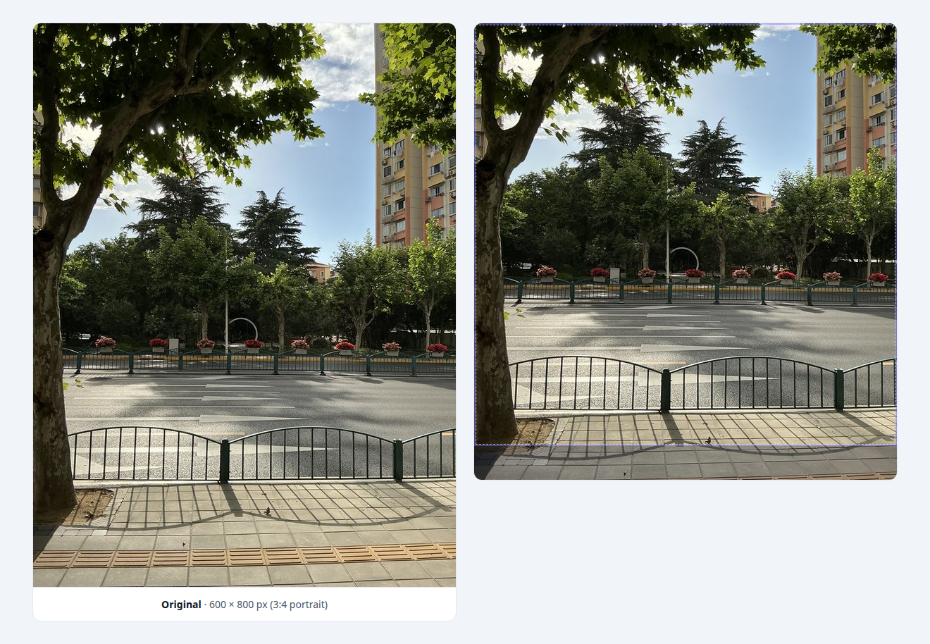
Cropping discards pixels from the edges of your photo, changing both the composition and the dimensions. A photo cropped from 4000×3000px to 1080×1080px loses roughly 80% of its original pixels — and the file size drops proportionally.
Cropping is lossless in one important sense: the pixels you keep are unchanged. There's no compression artifact, no quality degradation. You're simply choosing which part of the photo matters.
Every social media platform expects its own aspect ratio. Here are the most common ones:
| Platform | Aspect Ratio | Recommended Dimensions |
|---|---|---|
| Instagram Post (square) | 1:1 | 1080 × 1080px |
| Instagram Post (portrait) | 4:5 | 1080 × 1350px |
| Instagram Story / Reel | 9:16 | 1080 × 1920px |
| Facebook Cover | — | 851 × 315px |
| Twitter / X Post | 16:9 or 1:1 | 1200 × 675px |
| YouTube Thumbnail | 16:9 | 1280 × 720px |
| LinkedIn Cover | — | 1584 × 396px |
PixKeep's Image Cropper has one-click preset buttons for all these ratios. Pick the preset, drag to frame your subject, and download — no math required.
2. Resize — Scale to the Exact Dimensions
Resizing changes the total number of pixels in an image: the width × height in pixels. A 6000×4000px photo resized to 1200×800px drops from 24 megapixels to less than 1 megapixel — a 96% reduction in pixel count before any compression.
Does resizing reduce quality? When you scale down, you lose pixel information that cannot be recovered — but as long as the resized image is displayed at or below its natural dimensions (matching your screen or target platform), the quality loss is invisible to the naked eye. Scaling up, however, always introduces blur. For best results, always resize from a high-resolution original to the exact dimensions you need.
Here's what to aim for by image role:
| Image Role | Max Width | Rationale |
|---|---|---|
| Hero / banner | 1920px (2560px for retina) | Full-width background; needs extra resolution for sharpness on HiDPI screens |
| Content / blog | 1200px | Most content columns are 700–900px; 1200px covers retina screens with room |
| Thumbnails / grid | 400–600px | Match the exact slot size in your layout |
| 600px | Email client standard width; anything larger gets scaled down anyway |
Use PixKeep's Image Resizer for this step — it processes locally in your browser and supports batch resizing. For Instagram, see our dedicated guide: How to Resize Images for Instagram.
3. Compress — Shrink the File Size
Compression reduces the file size in bytes (KB/MB) — not the pixel dimensions. This is where things get technical, and where most people get confused. Let's break it down.
Lossless vs. Lossy Compression
Image compression comes in two fundamentally different types:
- Lossless (used by PNG): No image data is discarded. The original pixels are mathematically reconstructed exactly. File size reduction is modest — typically 10–30%. Use this when you need pixel-perfect sharpness: screenshots, logos, text-heavy graphics.
- Lossy (used by JPG, WebP, AVIF): Some visual data is intelligently discarded based on what the human eye is least likely to notice. File size reduction is dramatic — typically 50–80% at sensible quality settings. Use this for photographs and any image where a slight, imperceptible quality tradeoff is acceptable.
For web use, lossy compression is almost always the right choice. The question isn't whether to use it — it's how much.
What Are Compression Artifacts?
When you compress a photo too aggressively (typically below 60% quality for JPG/WebP), visible distortions appear. These are called artifacts. Look for:
- Blocky areas (macroblocking): The image breaks into visible 8×8 or 16×16 squares, especially in smooth gradients like skies and skin tones. This is the most common artifact.
- Ringing / halos: Ghost-like edges appear around sharp transitions — text on a background, tree branches against sky.
- Color banding: Gradual color transitions (sunsets, studio backgrounds) become stair-stepped bands of solid color instead of smooth gradients.
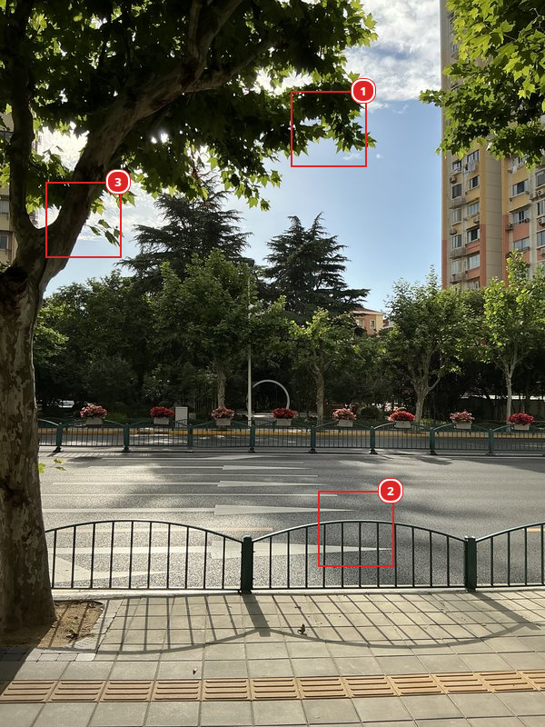
<img> scales with the reading column width. DSSIM values below are whole-image, not per-crop — so #1, #2, and #3 at q=20 all share DSSIM 0.21. Numbers are specific to this 600×800 test source; your own image's values will differ with its dimensions and content complexity (e.g. the same q=20% on a 3024×4023 source with more fine detail can land around 0.13, not 0.21).#1 Sky meeting branches — ringing & banding
The top of the photo where tree branches silhouette against open sky. This 80×80 crop shows both halves of compression's smooth-gradient problem in one place: tree branches meeting the sky produce ringing (oscillation patterns on the sky side of the edge — also called mosquito noise), and the smooth gradient itself degrades into banding at low quality. Together they're why photos with sky often look worse than photos without.


#2 Fence — edge ringing
The foreground metal rail against road surface — sharp transitions that the codec has to keep crisp without introducing halos.


#3 Trunk & lower branches — texture loss
The left edge of the photo: tree trunk and lower branches against pale sky. At low quality the bark texture smears into mush, and the branches' silhouettes against the sky get muffled — you can see the trunk flatten and the branches lose their crisp edges by q=20.


What to look for in each region:
- #1 Sky meeting branches (top-center). Tree silhouettes against open sky — ringing (oscillation patterns on the sky side of the edge) plus banding (8×8 macroblocks forming across the smooth gradient) at low quality.
- #2 Fence (foreground rail). Curved metal rail against road — ringing on a textured background. Same artifact type as #1, less visible because the road texture masks part of it.
- #3 Trunk & lower branches (left edge). Bark texture on the trunk smears; branch silhouettes against sky muffle at low quality — a mix of texture loss and ringing on a darker background.
A good rule of thumb: at 75–85% quality, most photos look identical to the original at normal viewing distance. Below 60%, artifacts become noticeable to casual viewers. The exact threshold varies by image content — photos with large areas of smooth color (skies, studio backgrounds) need higher quality than busy, detailed images.
Format Choice Matters Too
At the same visual quality, different formats produce different file sizes. Our format comparison benchmarks show that WebP is typically 25–35% smaller than JPG, and AVIF is another 20–30% smaller than WebP. The numbers below are excerpted from our 12-megapixel test photo (full method in the linked article):
| Format | Quality | File Size | vs JPG | dssim |
|---|---|---|---|---|
| AVIF | 70 | 2,083 KB | −17.6% | 0.00124 |
| HEIC | 50 | 2,120 KB | −16.2% | 0.00127 |
| WebP | 82 | 2,282 KB | −9.8% | 0.00160 |
| JPG | 80 | 2,529 KB | — | 0.00138 |
| PNG | lossless | 16,671 KB | +559% | 0 (lossless) |
All four lossy formats score below 0.01 dssim — meaning they are visually indistinguishable from the original at normal viewing distance. Same target fidelity, very different file sizes. That's why picking the right format matters as much as picking the right quality.
For web photos, use WebP with a <picture> element and a JPG fallback. For email or legacy systems that don't support WebP, stick with JPG. PNG is for screenshots and graphics — never use it for photographs (it'll be 5–10× larger for zero visual benefit).
The Complete Workflow: Crop → Resize → Compress
Here's the pipeline that produces the smallest possible image at the quality you need:
Step 1: Start with the Right Source
Always work from the highest-quality original available. Don't re-compress an already compressed image — each generation of lossy compression discards more data, and you can't recover what's already lost. PixKeep's compressor shows an orange mark on the quality slider that estimates your original's quality from its file size — if it shows 40%, your source was already heavily compressed, and further compression will quickly degrade quality.
Step 2: Crop and Resize First
This is the step most people skip — and it's the most impactful. A 6000×4000px camera photo compressed to 80% quality is still enormous because you're compressing 24 megapixels when your website only displays maybe 1. Resize to your display width first:
- Full-width hero images: 1920px (or 2560px for retina screens)
- Content / blog images: 1200px — plenty for most layouts
- Thumbnails: Match the exact slot size — typically 400–600px
Use our Image Cropper to frame your subject, then Image Resizer to scale down. Resizing alone can reduce a 5MB camera photo to 300KB — a 94% reduction before you even touch the quality slider.
Step 3: Compress at the Right Quality
Now that you've removed the pixels you don't need, compress what's left. Try our free image compressor which processes files locally in your browser:
- Select your image — an orange mark appears on the quality slider showing your original's estimated quality. Always drag below the orange mark — if you stay above it, the file may get larger instead of smaller.
- Set quality to 80% in WebP format (recommended starting point). This typically cuts file size by 50–70% while looking identical at normal viewing distance.
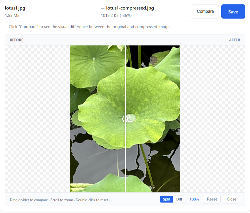
- Preview the result with the split-view comparison or pixel diff heatmap (see screenshots below).
- If quality looks good, download. If not, adjust by 5% and try again.
Step 4: Verify the Result
Compare the original and compressed versions side-by-side at 100% zoom. For pixel-level inspection, switch to Diff Heatmap mode. Red and yellow areas show where compression changed pixels; blue areas are identical to the original.
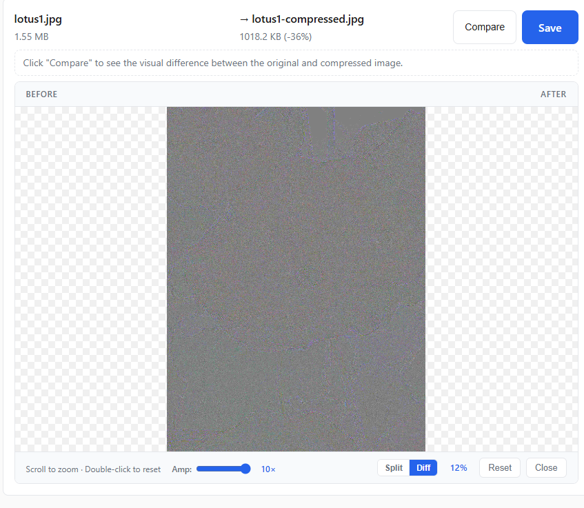
If the diff heatmap is essentially a solid gray rectangle — meaning almost no pixel differences — your compression setting is perfect. If you see colored blotches in important areas (faces, text, product details), increase quality by 5% and re-compress. This verification step takes 10 seconds and guarantees you never ship an over-compressed image.
For a single-number check, use DSSIM. Visual inspection is great for catching local artifacts, but every Compare panel also shows a DSSIM score in its header — the perceptual distance between original and compressed, computed in your browser using the same kornelski/dssim-style 1/SSIM − 1 metric convention we use in our format benchmarks (luma-channel block-grid SSIM, approximated for in-browser use). Lower scores mean the compressed image is closer to the source:
| dssim | Interpretation |
|---|---|
| < 0.001 | Lossless quality |
| 0.001 – 0.01 | Visually identical |
| 0.01 – 0.05 | Imperceptible |
| 0.05 – 0.11 | Barely noticeable |
| 0.11 – 0.25 | Visible difference |
| > 0.25 | Obvious difference |
If your image lands below 0.01, ship it. If it's above 0.05, drop quality or reduce dimensions. Pair the DSSIM number with the spatial diff heatmap: the heatmap localizes where artifacts live (faces, edges, sky gradients), while DSSIM summarizes the total perceptual cost. This is the verification layer AI chatbot tools can't replicate — they have no idea what your specific image looks like after compression.
Step 5: Check Your Size Targets
Google Lighthouse flags images over 100KB as optimization opportunities. After following the resize→compress→verify pipeline, aim for these targets:
- Hero images (1920px, WebP 85%): Under 300KB
- Content images (1200px, WebP 80%): Under 150KB
- Thumbnails (400px, WebP 75%): Under 50KB
If you're over these targets, try dropping quality by 5% or reducing dimensions slightly. Run your site through Google PageSpeed Insights after optimizing — pay attention to the mobile score, which is what Google uses for ranking.
If You're New to This — Use Our Scene Pages
Not sure what dimensions you need? PixKeep's scene pages are pre-configured for common tasks. Each one handles all three steps with the right settings already dialed in:
- Sending photos by email? → Email Attachment pre-sizes to 600px and compresses for small attachments.
- Posting to Instagram? → Instagram Post pre-sets to 1080×1080px at optimal quality.
- Making a YouTube thumbnail? → YouTube Thumbnail pre-sets to 1280×720px.
- Updating your LinkedIn cover? → LinkedIn Cover pre-sets to 1584×396px.
- Setting up a Discord server? → Discord Banner, Discord PFP, or Discord Emoji are each pre-sized for their use case.
Recommended Settings by Use Case
Websites & Blogs
| Image Role | Format | Quality | Max Width | Target Size |
|---|---|---|---|---|
| Hero / banner | WebP | 85–92% | 1920px | Under 300KB |
| Content / blog | WebP | 75–85% | 1200px | Under 150KB |
| Thumbnails | WebP | 70–80% | 400–600px | Under 50KB |
| Screenshots, text | PNG | — | As needed | Under 200KB |
Serve WebP to modern browsers with a JPG fallback using the <picture> element:
<picture>
<source srcset="photo.webp" type="image/webp">
<img src="photo.jpg" alt="Description" width="1200" height="800">
</picture>
Social Media
| Platform | Dimensions | Quality | Format |
|---|---|---|---|
| Instagram Post | 1080×1080px (1:1) | 85% | JPG |
| Instagram Story/Reel | 1080×1920px (9:16) | 85% | JPG |
| Facebook Post | 1200×630px | 80% | JPG |
| Twitter / X Post | 1200×675px (16:9) | 80% | JPG |
| LinkedIn Post | 1200×627px | 80% | JPG |
| YouTube Thumbnail | 1280×720px | 85% | JPG |
Social media platforms re-compress everything you upload. Upload at the exact recommended dimensions and maximum reasonable quality — let their servers do the final compression pass. If you pre-compress too aggressively, you get double-compression artifacts. For a deep dive on Instagram specifically, see our Instagram Resize Guide.
- Quality: 70–80% (JPG only — most email clients don't render WebP)
- Max width: 600px
- Target total: Under 1MB for all images combined (many providers block larger emails)
- Quality: 90–95%
- Resolution: 300 DPI minimum
- Format: TIFF or high-quality JPG
Common Mistakes to Avoid
1. Compressing Full-Resolution Camera Photos
A 6000×4000px photo at 80% quality is still enormous because you're compressing 24 megapixels when your website displays maybe 1. Resize to your display width first. This single mistake is responsible for most bloated websites.
2. Using the Wrong Format
PNG for a photograph = 5–10× larger than WebP for zero visual benefit. WebP for an email attachment = some recipients see a broken image. Match the format to the use case, not to habit.
3. Re-Compressing an Already Compressed Image
Every round of lossy compression discards more data. Taking a JPG saved at 60% and re-compressing at 80% doesn't bring back lost quality — it just makes a larger file with the same artifacts. Always work from the highest-quality source available. The orange mark on the slider helps you spot pre-compressed images before you start.
4. Skipping the Crop Step
If your photo includes empty sky, distracting background elements, or a poorly framed subject, compressing it won't help — it'll just be a well-compressed bad photo. Crop first to focus the composition. Every cropped pixel is a pixel you don't have to resize or compress.
5. Compressing Below 60% Quality
Visible artifacts appear. The file size savings aren't worth it. If you need smaller files, resize to smaller dimensions instead of crushing quality. A 600px-wide image at 80% quality loads faster and looks better than a 1200px-wide image at 40%.
6. Setting Quality Too High "Just to Be Safe"
Quality 95% produces a file that's nearly identical to 85% but 2–3× larger. The difference between 85% and 95% is invisible to the human eye, but the file size difference is very real. Use the diff heatmap at 1× zoom to calibrate your eye — you'll likely find that 80% is already perfect.
7. Not Checking Results on Mobile
Images that load instantly on desktop Wi-Fi may crawl on a mobile 4G connection. Google's ranking uses the mobile PageSpeed score. Always test on mobile after optimizing.
Pro Tips
Tip 1: The Orange Mark Is Your Friend
The orange mark on the quality slider shows your original image's estimated quality, found by matching its file size against the browser's encoder. If the slider is above the mark, the file may get larger — you're re-encoding at higher quality than the source, which wastes bytes for zero visual gain. Always drag below the mark for real compression. The mark disappears for PNG files since they use lossless compression and have no quality level to estimate.
Tip 2: Use the Right Format for the Job
- WebP: Best for web photos — 25–35% smaller than JPG at same quality. Serve with
<picture>fallback. - JPG: Photos where universal compatibility matters — email, legacy browsers, every CMS.
- PNG: Screenshots, logos, text-heavy graphics. Lossless — only when pixel-perfect sharpness matters more than file size.
For real benchmark data, see our complete format comparison.
Tip 3: Batch Process for Efficiency
If you have many images, use our batch processing feature to compress them all at once with the same settings — in parallel batches, all processed locally in your browser. Combine with resize for a complete optimize-once workflow.
Frequently Asked Questions
Should I crop, resize, or compress my image?
They solve different problems. Crop if you want to remove unwanted parts of the photo. Resize if the dimensions are too large for where you're putting it. Compress if the file size is still too big after resizing. Most real-world tasks need at least two — crop first to frame your subject, resize to your target dimensions, then compress to hit your file size target.
Does cropping an image reduce its file size?
Yes — cropping removes pixels, which reduces both the dimensions and the file size. A photo cropped from 4000×3000px to 1080×1080px drops from roughly 3-5MB to about 500KB before any compression. But cropping changes the composition — only use it when you want to remove parts of the photo, not just to make the file smaller.
What is the best quality setting for web images?
75–85% in WebP format is the sweet spot for most web images — it cuts file size by 50–70% with no visible quality loss. For hero banners and photography-heavy pages, use 85–92%. For thumbnails and secondary images, 60–75% is acceptable. Below 60%, compression artifacts become noticeable to casual viewers. Need exact numbers? See our benchmarked format comparison.
Do I need to resize images before compressing them?
Yes — resizing first is the single most impactful optimization. A 4000px photo resized to 1200px drops from ~5MB to ~300KB before any compression. Compress that to 80% WebP and you're under 100KB — a 98% total reduction with no visible quality loss. Use our Image Resizer for this step, then send the result straight to the Image Compressor.
Conclusion
Making images smaller isn't one operation — it's a pipeline. Crop to remove what you don't need. Resize to the exact dimensions your target requires. Compress to shrink the file size without visible quality loss. Do them in that order, and a 5MB camera photo becomes a 100KB web-ready image that looks identical to the original.
Start with our scene pages if you're a beginner — they pre-configure everything for email, Instagram, YouTube, and more. If you're comfortable with individual tools, use our Image Cropper → Image Resizer → Image Compressor pipeline. Everything runs locally in your browser — no upload, no account, no privacy tradeoff.